UX Design
Lino
AI-Powered Mental Health Journaling Ecosystem
Project overview
The Problem
Mental health struggles among young people are rising sharply, yet the tools designed to help often compound the issue.
- The Reality: 75% of all mental health disorders manifest before the age of 24, and currently, 21% of young people actively struggle with their mental health.
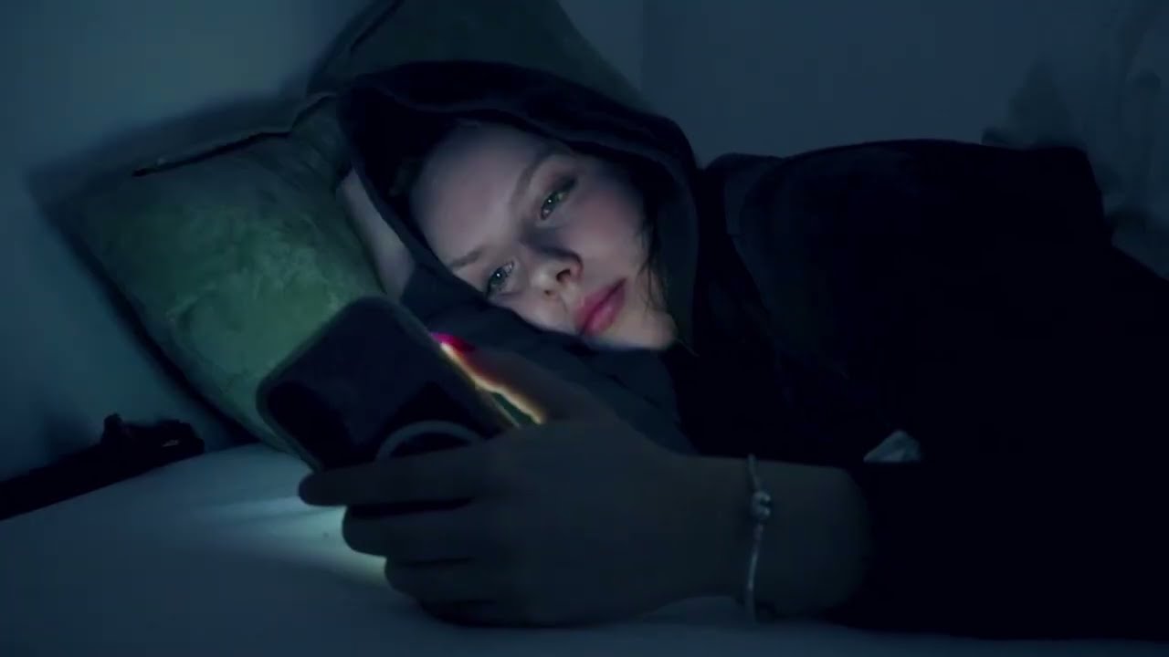
- The Screen-Time Trap: Under intense academic pressure, teenagers and young adults frequently turn to smartphones to “relax” or “distract” themselves.
- The Vicious Cycle: Instead of relieving stress, digital tools trigger compulsive doom-scrolling, creating a feedback loop of digital fatigue, emotional suppression, and increased isolation.
The Approach: What We Did
We aimed to design a tactile interaction that effortlessly bridges the physical act of writing with smart digital insights. Through a rigorous UX process, conducting interviews, surveys, wireframing, and user testing, we developed a seamless physical-digital ecosystem.
The Smart Reflective Pen
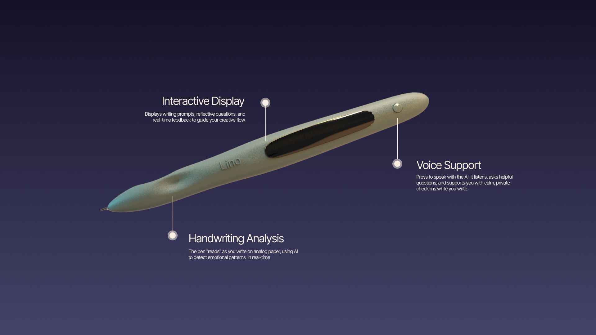
A hybrid tool designed to support emotional reflection and regulation directly on the page, completely free from screen distractions.
- Real-Time AI Analysis: By integrating handwriting and content analysis into the tactile act of journaling, the pen interprets text as the user writes.
- In-the-Moment Guidance: It detects emotional cues instantly and delivers personalized, gentle prompts directly through the pen display, helping young people process and regulate feelings without ever looking at a smartphone.
The Companion App (Digital Reflection)
A secure, unconditionally judgment-free space that aggregates data over time to show long-term behavioral trends and suggest actionable, real-world routines. The primary focus of the entire ecosystem was shifted from clinical tracking to empowering users to actually express and process their raw emotions.
Key Decisions
Pivoting from an Overwhelming Dashboard to a Passive Companion
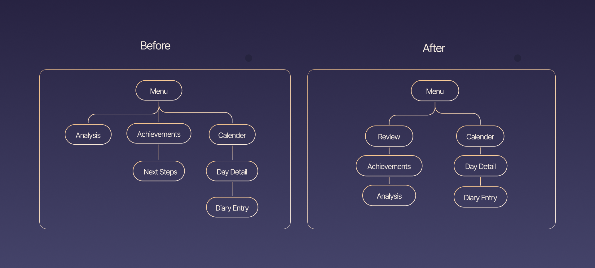
- The Failure: Our initial app design centered around a traditional dashboard filled with cold graphs, raw metrics, and heavy data visualizations.
- The Insight: User testing quickly revealed this was a mistake. The data-heavy interface was confusing and overwhelming for anxious users. Worse, it felt clinical and performance-driven, making users feel judged by their own data rather than supported. It also forced them to constantly “check into” the app, completely defeating our goal of reducing screen time.
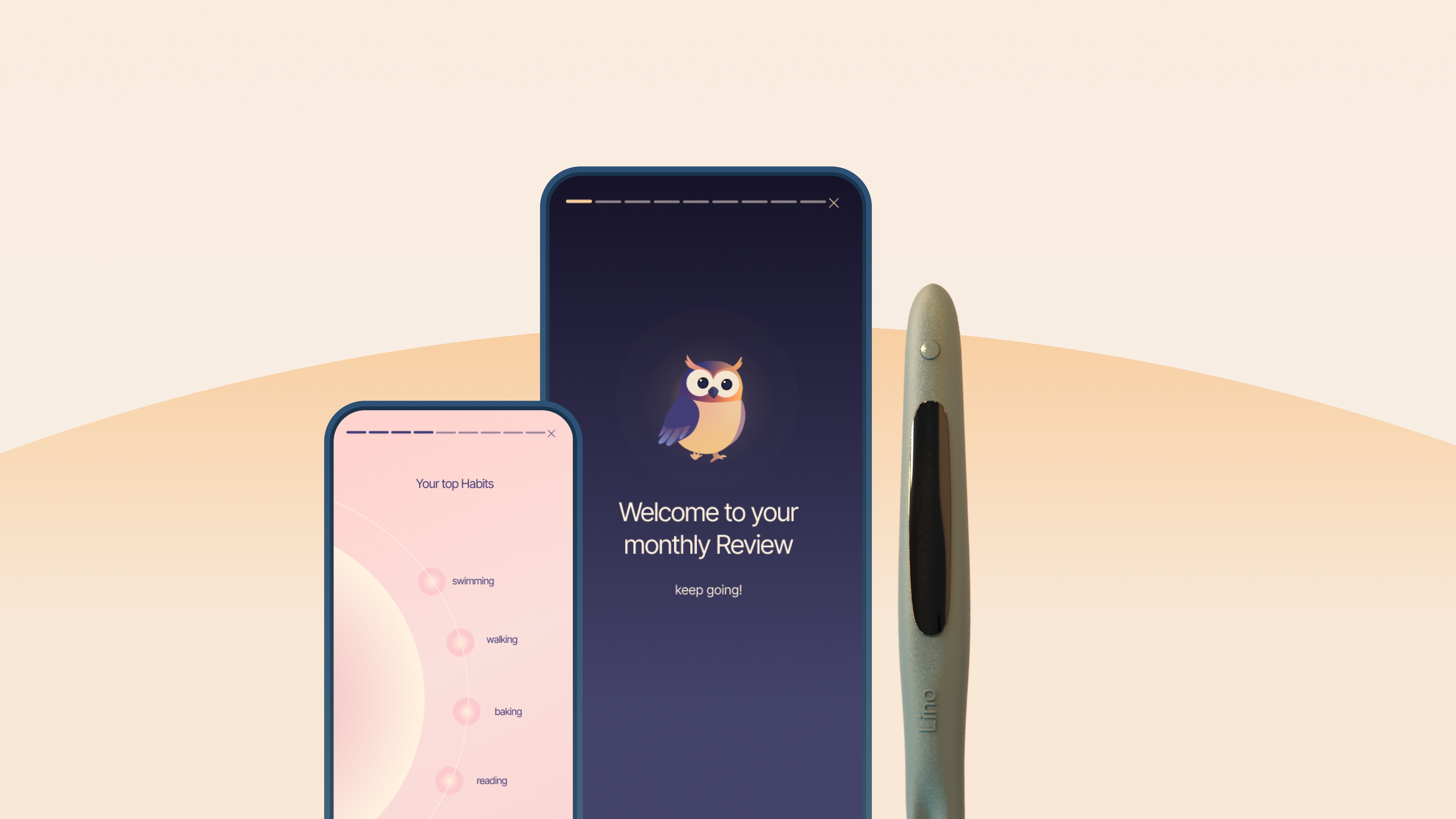
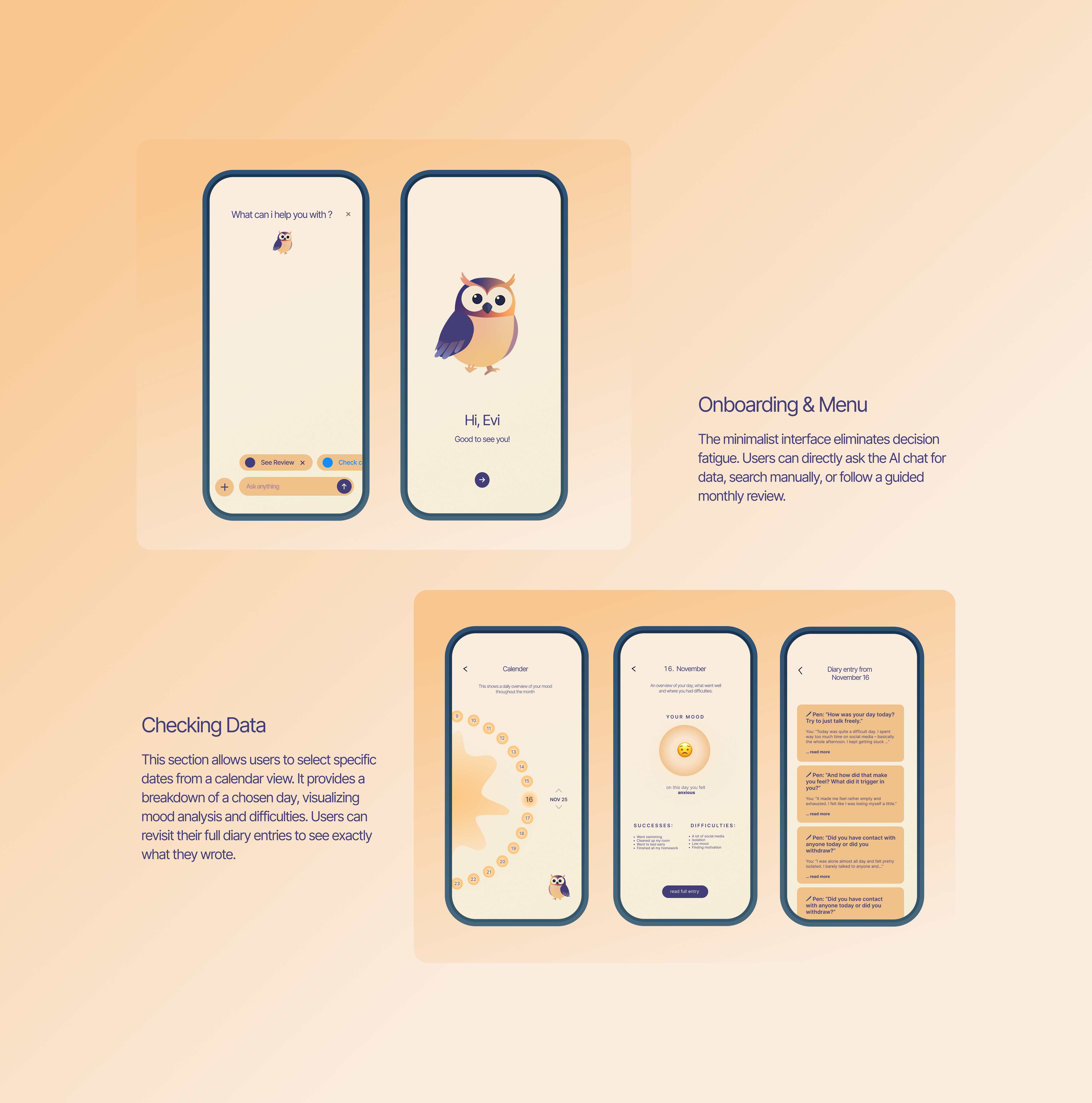
- The Fix: We fundamentally shifted the concept to make the app entirely separate from the immediate journaling experience. The app was transformed into a passive tool: users only open it if they intentionally want to look up a specific past entry, or when they receive their monthly review reminder.
Redesigning the Monthly Review into a Low-Load “Story” Format
- The Pivot: To replace the stressful, performance-like feel of data charts, we needed a visual language that felt deeply therapeutic, encouraging, and safe.
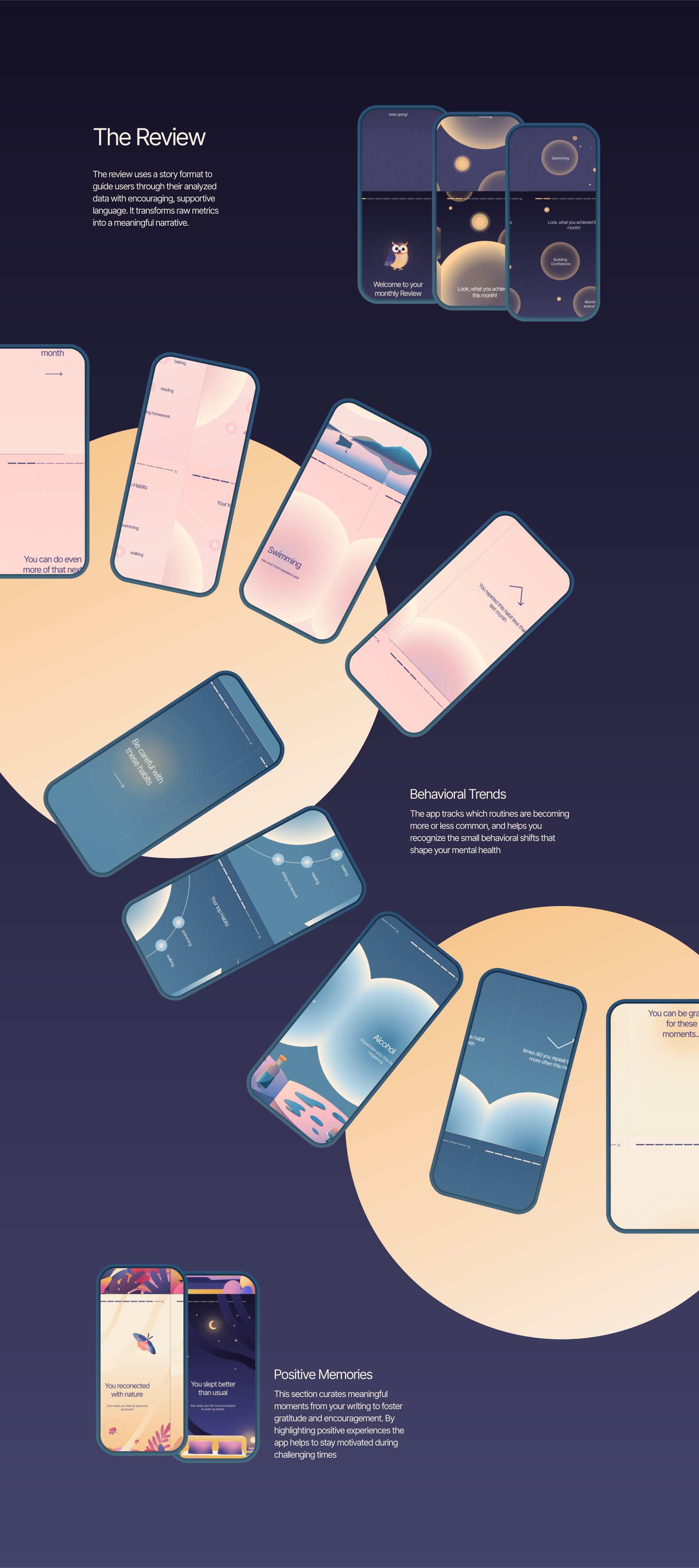
- The Fix: I designed the monthly review using a highly visual, familiar “Story Format.” Instead of forcing users to decode complex statistics, this format translates raw data into a warm narrative, using encouraging and supportive language. By combining a calming design system with positive reinforcement, the interface shifts the focus entirely onto celebrating emotional expression and small wins.
Design Philosophy: “Calm, Not Clinical”
From our primary research, a recurring insight stood out: young users don't want an app that feels like a doctor's office or a clinical tool that enforces a rigid routine. They wanted a space that felt safe and grounding, yet light and playfully hopeful.
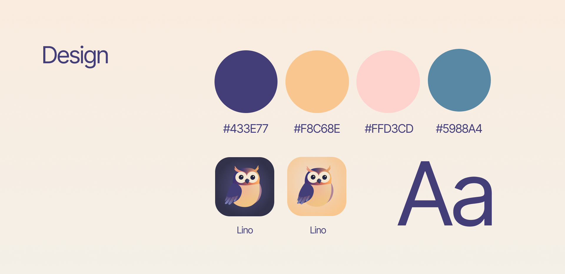
- A Friendly Guide: We designed a dedicated mascot to act as a gentle, non-judgmental companion — transforming the experience from a cold data-tracker into a warm conversation with a friend who guides you through your reflections.
- Visual Warmth: We balanced a calm, non-stimulating palette with friendly typography and organic shapes to avoid a sterile aesthetic and keep the interface inviting.
- Hopeful Tone: Micro-copy was crafted to celebrate small wins and validate feelings, completely removing medical jargon, clinical phrasing, and diagnostic labels.
- Light Touch: Playful interaction details — like soft story transitions and charming mascot animations — were used to make reflection feel like an uplifting moment rather than an emotional chore.
The Outcome
As a university concept project, this study successfully validated a new UX model for off-screen interaction.
- Validated Concept: User testing proved that limiting the app's presence and separating the action (writing) from the analysis (the app) significantly reduced user anxiety. Users specifically highlighted that the ecosystem felt like a “safe haven” where they could express negative thoughts without feeling judged.
- High-Fidelity Prototype: Delivered a fully mapped, low-friction user flow, a calming design system, and visual UI screens ready for conceptual presentation.
- Project Delivery: Combined the digital interface design with storyboard and concept video to effectively pitch the hybrid physical-digital solution.
Concept Video